
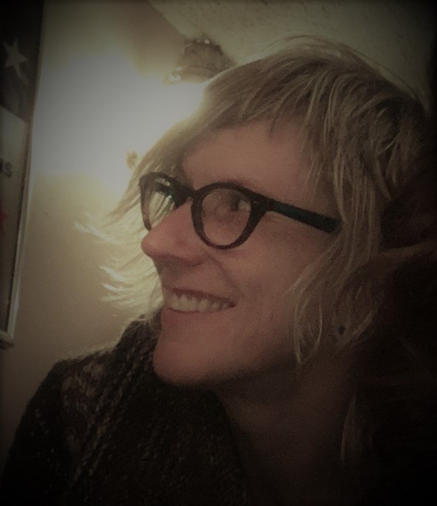
Kjirsten Severson
excerpts from the i-series
introduction and interview by Coleman Stevenson
Kjirsten Severson
Philosopher, poet, and artist Kjirsten Severson was raised in Rapid City, South Dakota, and has lived in the Portland, Oregon, area since 2003. She holds Master’s degrees from Duquesne University in Western Philosophy and The George Washington University in Feminist Ethics. A dedicated educator, she has taught philosophy at Clackamas Community College since 2005 and volunteers as an instructor at the Senior Center in Astoria through Clatsop Community College’s Encore Program. She was one of a handful of instructors featured in the 2015 New York Times Sunday Review op-ed piece “Lecture Me. Really,” by Molly Worthen, on the value of lectures in college, evidence of her charismatic teaching style and ability to motivate students to think critically and love learning.
She is the author of an unnarrated memoir, a manuscript of 350 pieces of minimalist concrete poetry crafted on a 1936 LC Smith Corona typewriter, selections from which were published in Gramma in February of 2017. Since then, Severson’s vision has manifested in less-contained forms, truly hybrid work for which the label of “concrete poetry” no longer suffices. The standard page became too limited a canvas; her work needed space, size, DRAMA. Since this shift, her visual work has been shown in galleries around Portland, including the debut of her large-scale works on canvas, or the Very Big Typographical Art Project, at Rising Room Gallery in February of 2016.
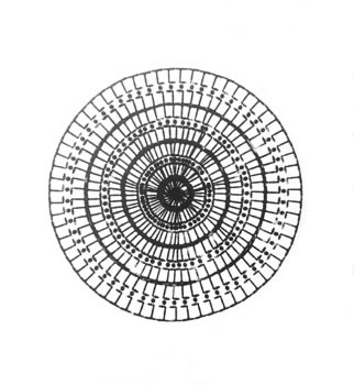
Around that time, she decided to go “off the grid,” as she puts it, of both the typewriter and manuscript. The initial results of this experiment comprise the i-series from which these pieces come. I have watched this process over the last year with keen interest as the letter forms accumulated, no longer into known words, but shapes — visual expressions. Like so many great text+image artists before her, she has had to unsee, to unassume, the habits of a lifelong relationship with language. Thanks to adventures in modern typography, and text artists like Ian Hamilton Finlay and Jackson Mac Low, the culture has an eye for this type of work, a way to place it. We know now that shape, size, color, and movement of text can be as important, if not more important, that the direct information the letters stand in for. There is potential for richer communication; plain text fails us so often in its deep ability to be misunderstood from person to person. If we can also see what it means, we might finally grasp the nuances of another’s thought and feeling.
As ordered as these final compositions appear at a distance, up close you can see a wildness, a storm, in the overlapping of letter and punctuation shapes. There were no drafts. Nothing was cleaned up or recrafted. What you see here is the result of Severson’s willingness to be guided by the work, to linger in the unknown, to accept the muse full-body, and it has achieved something fresh and alive. I’m thrilled to present the following additional insights into these works, direct from the artist’s sprightly mind.
Tell me how this sort of visual inquiry came to be...How does a philosopher move away from using structured language to express ideas? It was through my study of philosophy that I was led to the conclusion that we cannot afford to answer our philosophical questions strictly within a rational framework. Which to many, most likely, the large majority of professional philosophers, is heresy. However, philosophy has a rich history of pulling from the mystical, and in my studies, I was exposed to some of these marginalized philosophers of the mystical. And by “mystical,” I do not mean religious. I mean the ineffable, fleeting moments that strike us, giving us a sudden felt-experience of the sheer majesty of our existence in this world.
I studied in a rather traditional program at a Catholic university in Pittsburgh, so, when I put forth my idea to write my dissertation from the location of the mystical, I was told I could use my dissertation to explain it, but not to perform it. At that point, I rapidly lost all interest in completing the program. Instead, I quit school, worked for two years, saved money and packed whatever I hadn’t given away into a van and drove around the US with my love at the time and two cats. After quite a few months, we happened to be in Portland when the van, which broke down often, could no longer be repaired. We found an affordable double studio in North Portland with windows lining two of the four walls and warm hardwood floors. It was in this space I decided to write the dissertation for myself. Nonetheless, I would type a few pages on my laptop and become stumped. To relax, I started to play around on an old Corona Sterling typewriter I had been gifted before leaving Pittsburgh.
I had no idea what I was typing, but the pages started stacking up. I would get frustrated with myself as I began to spend more time on the typewriter than on my laptop. But after about 27 pages, I took a look at them, one after another. And I realized that my dissertation was being written from the typewriter. There was a quality to the writing that allowed me to see “through” language and to catch a glimpse of that which cannot be put into words. To feel it, and to “know” from it. The expressions seemed to play with language; they didn’t “use” language, they made a display of language and made language point to that which cannot be captured by it. I saw that the space on each page played as primary a role as the typed characters and words. It was the blank space on each page that, for me, pulsed with the ineffable. At that point, I surrendered and allowed myself to engage with the typewriter freely. I never went back to the dissertation on the laptop. Eventually, I began to notice where one chapter ended and another began. By the time I had ten chapters, I knew it was complete.
The earlier incarnations of this type work began on 8.5x11 paper. What made you want to move that to such a large scale? Mark Rothko, I’m sure of it. When I saw my first Rothko pieces live at MOMA, it was the Rapture. I was taken completely. His paintings didn’t allow me to look at them with my eyes; they engulfed my entire body. It was a body to body experience. Mid-way through the creation of the manuscript, I started to obsess on the idea of turning those pieces into “full-body experiences.” Luckily, living in Portland, I met many artists. And one artist, Ariana Jacobs, was unbelievably generous to me. I told her my desire, and she suggested silk screening. I enlarged all the typewriter characters on a copy machine and she walked me through the entire process of burning them onto silk screen frames. She found me a good deal on used frames, got permission for me to use the art space of the collective to which she belonged, taught me how to do it, and didn’t mind all the times I needed reminders or help when something went terribly wrong. She made my art project possible. I then began to reproduce pages of the memoir, letter by letter, onto canvas ranging from 5’x7’ to 8.5’x11’.
communion 119” x 77” acrylic on canvas
Your work defies classification to a certain extent. What issues have emerged for you as a creator working beyond genre? I do move through the art and poetry worlds differently than many of their inhabitants. Even though there is no obvious “path” for me to get these expressions out into the world, that hasn’t created any salient or lasting issues because the other inhabitants that I bump into are such generous people. They lend me their knowledge, time, suggestions, resources, encouragement and they open doors for me. They clue me into alleyways of possibilities that I wouldn’t have found without them. Ariana is only one example; I have a long list of people that have liberally assisted the development and promotion of this work.
Will your work with type as image progress, or do you see yourself exploring other avenues in the realm of visual art? I believe typography has so much richness specific to this moment in human history that I’ve barely started to explore; I cannot imagine moving on to other avenues at this time. With that said, though, I also know I cannot predict the twists and turns of this journey. I’m still the person who had no idea what was coming out of that Corona Sterling typewriter until I was 27 pages deep.
Is there a particular way you hope these pieces will be “read” or understood? Personally, I would love for others to feel the spiritual element I feel from these works. So maybe not “read” or “understood,” but felt. Even more so, I would want viewers to relax the drive to understand at first, and to let each piece radiate freely for a bit without the limitations brought on by our categorizations of judgment. To simply breathe while experiencing the piece. I want the piece to get in there, into the process of judgment, to alter judgment, to change the way we “know.” And then, with this transformed faculty of judgment, I want them to look at it anew, and to know from it.
Professionally, I have come to recognize that my role as an artist is to release images to the world. That’s it. Once they are released, they no longer are mine; they belong to the viewer. Each viewer’s experience with a piece is a conversation between it and that viewer. However, I have also learned that I can “encourage” a direction for that conversation with the titles I give each piece, and I have been exercising that power consciously and shamelessly.
What do you hope the viewer takes away? Respite from the pressures we feel from our social constructs, including this notion of identity. I want people to return to the world of prejudices, biases, bills and bureaucracy having felt something “other,” something upon which all those doings are predicated, but which those doings seem to bury so thickly and quickly that it is lost to our felt-experience. If we weren’t alive, we wouldn’t have all these pressures. It’s the re-cognition of their being alive that I hope viewers take with them.
communion detail
You mention a “spiritual element” in the i-series. I might even call it a religious theme of a sort, or at least a reference in shape and titles of some of the work. Could you comment further on that? All the pieces shown here are underscored by my recent reading of I and Thou, or, in German, Ich und Du, by the Jewish philosopher, Martin Buber (1878-1965). In that work, Buber explores the recognition of another person as a “world-within” and myself as a “world-within” that are created by our coming together. Buber illuminates the sort of communion that such a recognition can bring: Two human beings meet and magnetize together, creating “inner-worlds” even though they “believe” they are separate and independent of each other. It is, in the best sense of the word, a religious experience. It is the holy moment of becoming “I’s” that proliferate within.
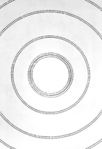
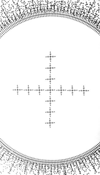
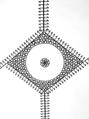
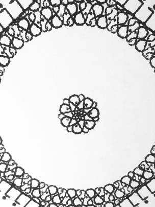
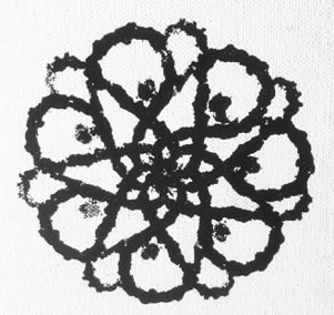
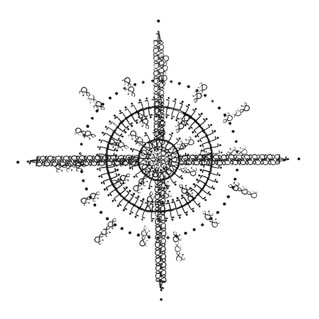
circlesi 10’ x 7’ acrylic on canvas
As well, most of the pieces here are playing with the religious icons of cross and halo, or as I see them, plus sign and circle. Through these pieces, the halo as circle eventually evolves into the sacred hoop whose presence made an impression on me as a white child growing up in the Black Hills, a place where the “regard and disregard of another” was sharply brought into my awareness by the living history of native and white relations. This continues to inform my artistic expressions.
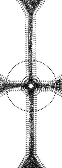
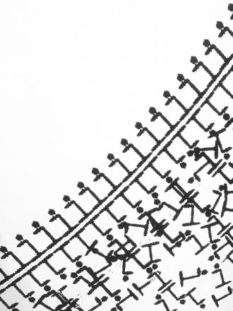
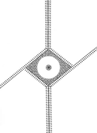
crosspluss 80” x 31” acrylic on canvas
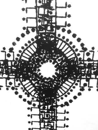
crosspluss detail
Meanwhile, the plus sign, in math, symbolizes “and”; in logic it symbolizes “either or both.” These pieces seem to use the plus sign to symbolize how we experience and regard each other: either or both. We can locate ourselves “outside” each other (either). Also, we can sense that we are the blood of each other (both). We can experience another human as a threat, a competition (either you or me, positioned to erase or consume the other). Also, we can experience a communion (feel ourselves through the “us” and step into the “and” between). In the two most recent pieces here, “ampersandsbetweenus” and “us,” the plus sign evolves into the ampersand.
ampersandsbetweenus 78” x 57” acrylic on canvas
ampersandsbetweenus detail
ampersandsbetweenus detail
ampersandsbetweenus detail
us 52” x 52” acrylic on canvas
The final overt religious icon that stands out to me is present in every one of these pieces: The “eye of god,” depicted on US dollar bills. I was unsurprised to find this image repeating in this work. Not long before I turned toward the i-series, I had a dream that was so impacting, it shook my every cell and atom. In the dream, I appeared quite small. It was if I were in space. It was dark all around me with purple stars barely twinkling their presence in the distance. My eyes were marveling at the endlessness around me. Something in my peripheral vision caught my attention. I turned toward it. Just as I was beginning to recognize the faint outline of an immense sleeping eye, it flashed open! It beheld me and I beheld it. And suddenly we shared a simultaneous epiphany: I was that giant eye/ I, and it was me. We were both so startled by this realization that we were left trembling. When I “came to,” I was still trembling. Even upon this recollection, I can feel the tremble. Since then, I’ve thought of this dream as “the eye of god.”
eyei 72” x 36” acrylic on canvas
Contributing editor Coleman Stevenson has been a guest curator for various gallery spaces in the Portland, Oregon, area, and has taught poetry, design theory, and cultural studies at a number of different institutions there. She created the Image + Text track in the Certificate Program at the Independent Publishing Resource Center where she has taught since 2015. Kjirsten Severson is online at kjirstenseverson.com/.