Gilding the Lily:
An Interview with Text and Image Artist Candace Jensen
by Contributing Editor Coleman Stevenson
Candace Jensen is committed to realizing a culture profoundly informed by deep ecology. She is a visual artist, poet, calligrapher, letterpress printer, activist, and woods witch, as well as a budding wild-tending horticulturalist. She has exhibited her artwork in California, New York, Philadelphia, Vermont, and Belgium. Jensen is currently working to establish a regenerative artist and writers’ retreat and residency space in rural Vermont with her partner, the mathematical artist Owen Schuh. She continues to collaborate with the nonprofit poetry and arts organization the Ruth Stone House in Goshen, VT, as well as with independent authors, curators, artists, and community organizers of many stripes. Jensen gratefully lives in Southern Vermont, on unceded traditional lands of the Elnu Abenaki band of the Western Abenaki Peoples.
CS: Candace, you are a poet, a letterpress artist, a painter, a calligrapher, a gardener…the list goes on. How do you know which mode is the right one for a particular project?
CJ: The projects speak for themselves and are always oriented to the material, and none of them stay in their pens very long. (I leave the gates unlocked.) I don’t conceptualize outside of the parameters of my media, very often. I like to keep it corporeal, keep it grounded. If I am in the letterpress shop, I am working with lead and ink and paper; if I am in my home studio, I’m working with wet or dry media on paper, but sometimes also more alchemical and magical stuffs. I think the modalities click through, like on a wheel— I’ll start reading a book, I’ll become enamored with a line or two, it inspires me to doodle and draw, which is sometimes calligraphic and sometimes chicken-scratch-graphic. Then I start responding to the line with my own line, then it becomes a whole dialogue in ink, and then I often switch it over to painting. Things take many forms throughout their creative lifespan within my creative practice.
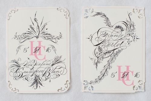
Extravagant wine labels for a wedding
I did feel a kind of pressure in the past as a student to commit to a particular medium, to a practice that I could master and make good on— do proud in the tradition, carry the torch and all. I called myself a figurative painter for a while like that was going to wrap it all up into a present. But it’s not me. My projects are like that Balla drawing of the dog in motion with rotary millipede feet, or a tantric dakini with dozens of arms. And they are always grandiose, even when they are peculiar or chaotic or simple— they have a grandiose context, they feel important and keystone to something, even if it’s just in my mind.
CS: I really like the comparison of your approach to your work to the Balla painting, and I can see some of that swirling dynamic energy of Futurism in certain pieces of yours as well (specifically some of the Gaia Illuminations). This makes me curious who you would cite as your primary visual influences as an artist.
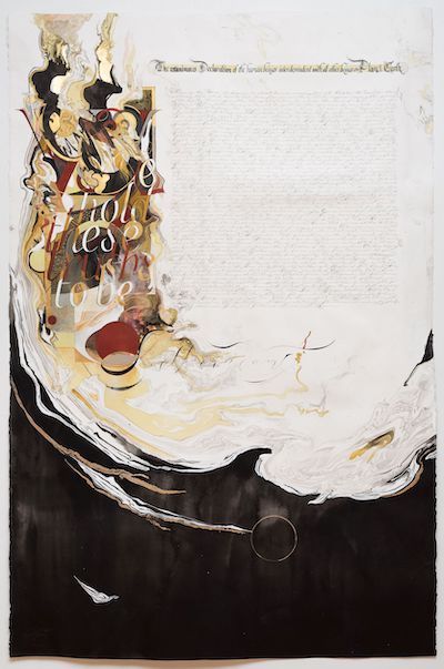
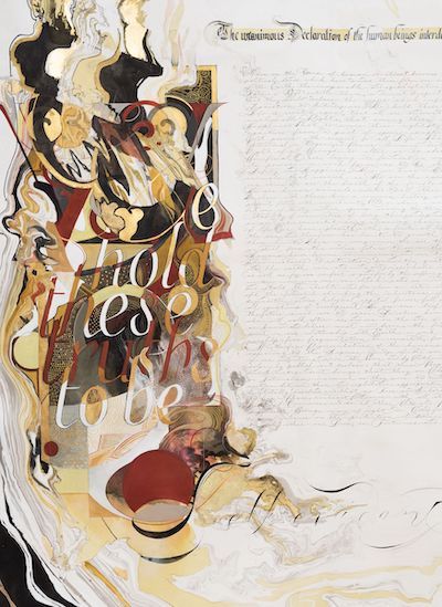
The Illuminated Declaration of Interdependence (2019), 42”x64” and detail of image, Goldenrod ink, sumi, ink, gold leaf, watercolor, gouache on hand-marbled paper, with words by the David Suzuki Foundation, the Founding Fathers of the so-called United States, and the artist
Totally classic question that I haven’t had the pleasure of reflecting upon for too long! I was enamored with the Futurists and Dada during art school, although my aesthetic ideal— what I was striving to make work like— always harkened to the medieval, the gothic, the renaissance, the romantic, the surreal and the miniature. Like, almost anything that differentiated me from Modernity. I was deeply skeptical of Cubism and postmodern painting for a very long time, but of course you can see their influence in my work also, both old and new. I’m merely a product of my time, and the influence biases of the time just before ours.
Reflecting back through the phases of my art education, and the collecting of approaches to form and composition, I stand on the shoulders of too many giants. I’m also so embarrassed by the European colonialist patriarchal supremacy of the art canon, which overloaded me on understanding a very small sliver of our global art heritage. But a few names stand out really obviously as giving bones to my work, as it came into its own through the years: William Blake, Gustave Moreau, Odilon Redon, and the nameless scribes of the Book of Kells and Lindisfarne Gospels. Right now, I’m reengaging with the work of Kathe Kollwitz, and completely loving Grandma Hilma getting her spot in the sun. I’ve had my nose buried in Carl Jung’s Red Book for a few years. Gosh I could go on. I’ll stop.
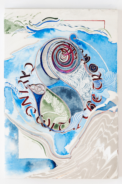
A New Scripture: Staying with the Trouble by Donna Haraway Illuminated Book Jacket, detail (2021), 17”x19”, hand-marbled paper with gold leaf, colored inks, graphite, poisonous Green Blood Aconite ink by Verdant Inks, and watercolors
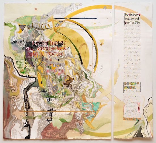
Chthonic Prayer (2019), 42”x46”, Goldenrod ink, watercolor, ink, graphite, gouache and gold leaf on hand-marbled paper, with words by Caroline Ross and Donna Haraway
CS: Tell me about your work with the Ruth Stone House.
CJ: The Ruth Stone House is a nonprofit in Goshen, VT, in the Green Mountains that both celebrates the legacy of the poet Ruth Stone, and creates community and programming to support contemporary poetry, especially through autonomous publishing and workshops. They are dedicated and scrappy and completely utopian, but they are grounded and hardworking people. All artists, poets, musicians.
I met Bianca Stone through mutual friends in 2019 I think, a year after I had relocated to Vermont from the Philadelphia area. We talked about illumination, and text + image, and poetry, and we were both a little starstruck and very enthusiastic about working together on something. Anything. I started joining their free, weekly poetry workshop, and volunteering time to their biweekly renovation efforts on the Ruth Stone House itself. Near the start of the pandemic, I became their Letterpress and Book Arts Director. And we just work on things and make magic happen— renovating a space in the house to be a functional printshop, started printing broadsides. I also began collaborating with Walter Stone on the Iterant Magazine project— I recruit great artists for our quarterly poetry magazine’s art feature, which totally defines the aesthetic of the journal. It’s fun! They have an incredibly creative family and their work is their life; they love poetry, and they love community, and I just like being part of that.
We started the Next Galaxy Poetry Retreat in 2021, and I support the retreat and workshops by running a letterpress field trip for attendees, teaching daily yoga, and playing support roles to Bianca, her husband the poet Ben Pease (the Executive Director of the RSH), alongside Walter and our friend Leanne who is our grant writer. We launched a capital campaign to raise the funds to finish repairing and renovating the historic farmhouse— and with that work underway we will have even more space to commit to letterpress and poetry workshops, hopefully running more of a residency out of the property in the coming years. The dates for Next Galaxy his year are August 17-21, 2022 and applications will open soon!
It’s a lot of work and energy, but it’s the magic of art and language both— making something out of nothing, every day. I like the autonomy and the empowered feeling of being able to make and collaborate under their umbrella, and I feel really valued and appreciated for all the weird, numerous ways I contribute to their project. I’ve been a poet and a writer most of my life, but it has always taken second stick to my visual art, so in some ways it's really empowering to be giving so much life to my writing, and to be around writers, collaborating.
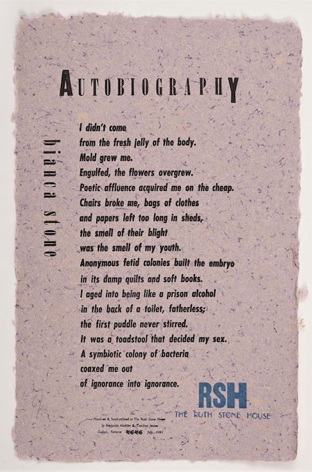
Broadside (2021) printed by Candace Jensen and Benjamin Aleshire at the Ruth Stone House with hand-set lead and wood type on a Vandercook proofing press; on multi-tone paper, hand-made by Aleshire; poem “Autobiography” by Bianca Stone, from the book What is Otherwise Infinite (Tin House Books, 2022). Signed copies of the broadside available at Ruth Stone House
CS: As a poet, what’s most important to you in terms of style, composition, etc. in your own work?
CJ: Repetition, and quality of melody are really key for me. They harken to the origin of language, in oral tradition, which I think is crucial to consider in order for the language of the poem to sing even as it is being signed. My poetry is pretty firmly rooted on the page, in the realm of the visual symbolic, but the aural quality of the words creates a cohesion and gravity for me. At my graduate program in Philly, we were really fortunate to have some excellent writers available to us as mentors, editors and advisors while developing our theses, and Hubert Cook really gave me a gift when he named and praised anaphora in my work. I thought he said amphora, which was delightful— and really, he did, because he gave me a peek at the vessel I was forming for my ideas through the brick-by-brick commitment to the playful repetition of words, sounds and phrases.
a poem by Candace Jensen
I learned the term “lyric essay” only a couple years ago, and it felt like a homecoming in some ways, to understand what my prose really is. And that allowed me to frame most of my poetry very differently, too. So my poetry is deeply rooted in the same power of narrative complexity that braided essays offer. My writing oscillates very easily between the two and sometimes struggles to pick one form over the other. And the Works Cited of my poems are enormous— like dissertation bibliography long. There is a beauty I think, in being helpless against the gargantuan agency of language itself— knowing the wave will knock you over, not even trying to stay standing.
I am hyper aware of polysemy and leverage it hard! I like loaded statements. Each phrase a loaded gun, a heavily laden maiden. I like to make turns of phrase punch in for the day shift and stay through the third shift, I work in double and triple entendre, I’m over-serious but I’m very jovial about it, usually. I prize incongruous unicorns of language and then I allow kitsch tropes to muck all over it, which is for the best really because purity isn’t a trait we can afford these days.
CS: In your visual/hybrid pieces, one of the standout elements is your use of color, especially the gilding that is often present. How do you decide what colors you’ll work for these series?
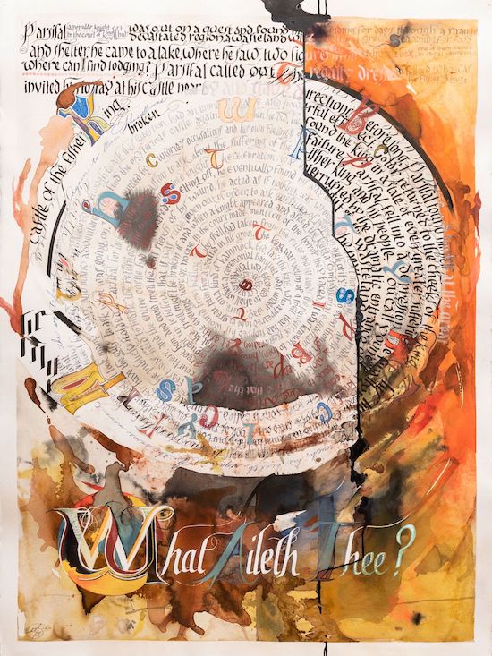
Parzival (2019), 22.5” x 30”, Coffee, vermilion, sumi, watercolors, gouache, ink, graphite, turmeric on paper, with words by Joanna Macy and Martin Shaw
Firstly, thanks so much for such a compliment. It’s a funny observation because I was in the cult of black and white (with a few earth tones mixed in) for a very long time. One of my critics in graduate school once looked at all my works-in-progress and then rolled their eyes at me and said, “you can use color, you know.” I struggled with color theory— it’s still not my strong suit— and I have always thought more in terms of contrast and design. Contrast between brilliance and darkness.
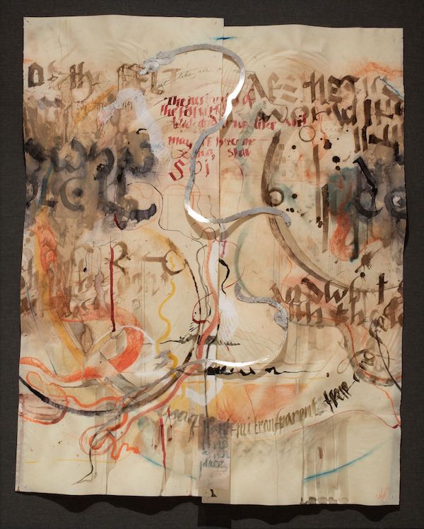
Aesthetics of the Felt World (scroll, 2018), 28” x 34”, coffee, tea, earth pigments, pencil, ink, gold and silver leaf on pergamenata
I think a lot of my color is incidental, but in very local and personal ways— I am gifted a small pan of home-made indigo, I live in a meadow of goldenrod, and then henceforth the golden-green, golden-brown, and woad-like blue of the flowers become omnipresent. I get stuck on colors symbolically or as nods to tradition, as well. I moved into iron oxides as I was developing my use of gold leaf pictorially, partially because of the rouge layer that would have traditionally been applied with the gold size. The gold leaf is a color, too, and I think in terms of multi-layered meaning for the metal, the pigments, and the way light reveals them or passes through them to illuminate whatever surface I am using. All these meanings mixing together, layers— a mess, but also sedimentary foundation for meaning, or at least a place one could go looking for it.
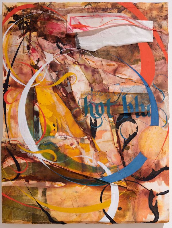
Gaia Illumination (White Hot Hot Blue) (2018), 18”x24”, oil and ink on collaged monotype on panel
All photos are from the artist. Learn more about Jensen’s work at CandaceJensen.com and on Instagram at @artist.cjensen.
The Ruth Stone House is planning a poetry reading on March 25th in Philadelphia to correlate with the AWP conference, to highlight some of the great poets they have had in Iterant. Find the details here.
Candace Jensen, Coleman Stevenson, and artist Thomas Little (interviewed previously in E·ratio) will launch a 3-person show in May of 2022 at Amos Eno Gallery. Their collective works will explore the chimerical realm of language + visual symbolism.